
Tad Blake-Weber, UXC | Portfolio
40 Indian Road | Waltham, MA 02451 | Email me
Redesigning lecture listing with data from Salesforce (2021)
Designed using Chrome Code Inspector
June 2020 – April 2021
Context
- Our “Find a lecture” page uses Salesforce data to display lecture information.
- The client department which manages this data in Salesforce needed more fields to display specific information
- because of the pandemic.
- a redesign of the form Churches use to request lectures.
- and to stop using work-arounds within the data held in Salesforce.
Team info
- Lead UX Designer (me)
- Product owner
- Lecture information stakeholders
- Salesforce admin
- Development Vendor (3rd party)
Step 1: Identify the opportunity
- Design needed refining along side more info being provided.
- Wanted prospective lecture visitors to have more ways freedom to participate.
- Provide users with better hierarchy to make info more scannable.
Goal #1: Improve the hierarchy & make information more scannable
Because the data is complex and the new design request was mainly driven by internal needs…
- The UX team felt we needed to at least apply best practice to the design if we were going to be adding new data, and complexity, to the pages.
- We worked with developers for the design
- Worked with our Salesforce admin to decide the best way to include new fields and how they would be displayed.
The design process I followed:
- Basic Discovery
- Listened to stakeholder requirments
- Scoped the requirements.
- Stakeholders provided the list of fields that needed to be displayed (and when)
- Create lo-fi mock up for review
- Reviewed with stakeholders
- Reviewed feedback from the stakeholders
- Iterated on original design
- Review with stakeholders again
- Shared with developers
- Developers built the design on staging site
- UX team did an initial QA review
- Shared the design with Stakeholders for green light to push to production.
- Design went live.
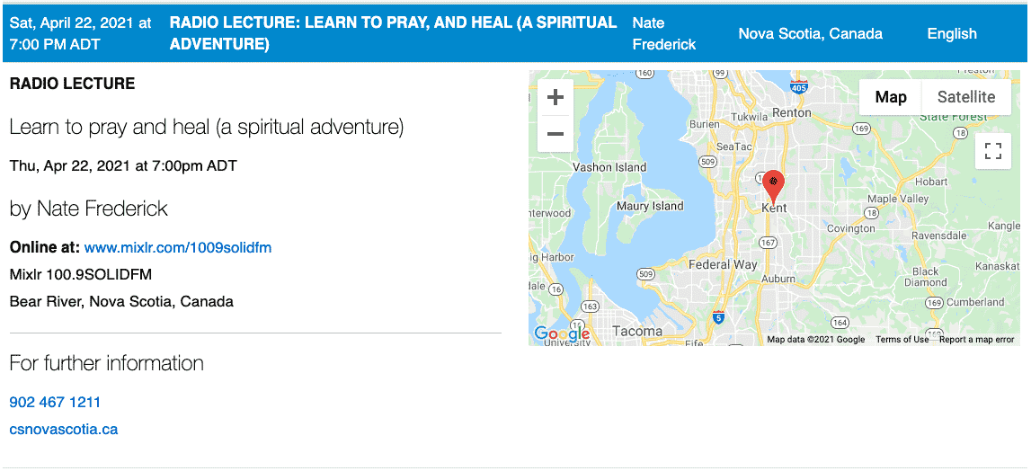
Desktop mock up: Radio lecture
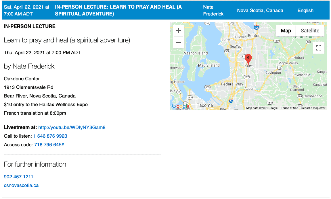
Desktop mock up: Live in-person lecture with live stream
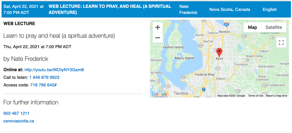
Desktop mock up: Live web lecture
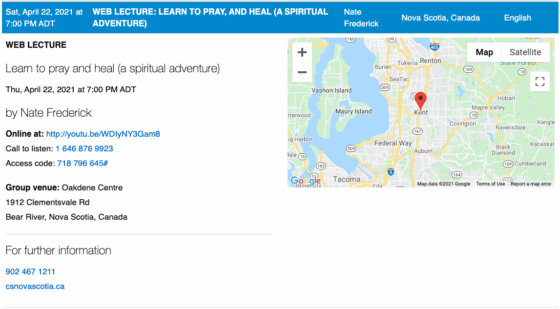
Desktop mock up: Web lecture with a group venue
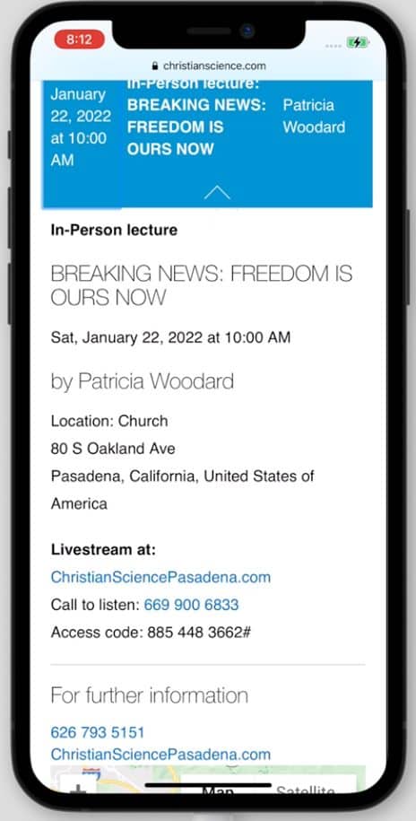
Mobile design — current
Results
What went well
- Though the data is complex, the it’s generally felt by stakeholders that the design manages well and displays information clearly.
- Product owners and stakeholders loved the new layout and hierarchy — felt it gave much needed clarity.
- No complaints received from general public or church members, though further user testing is needed and desirable, just hasn’t been prioritized since implementation.
What could be better
- No complaints — that could be a problem.
- We didn’t test before launch due to our immaturity.
Kaizen
Push for testing — advocate strongly that as an organization who is serious about it’s visitors, members that it must always do user testing.
FINAL PRODUCT: https://www.christianscience.com/find-us/find-a-lecture