Tad Blake-Weber, UXC | Portfolio
40 Indian Road | Waltham, MA 02451 | Email me
Update of the Church’s Annual Meeting player UI (2022-2023)
Designed using Figma
October 2021 – April 2022…final code went live June 2023
Team:
- Lead UX Designer (me)
- Product owner
- Main stakeholders: Board of Directors
- UX Information Architect/Researcher
- SMEs: Internal Software Developer + Audio Engineer
- Development Vendor (3rd party)
Step 1: Defined scope for the design and what would be tested
- Make the design more modern — find out if users care, don’t notice, or anything else.
- Find out if the “viewing options” makes sense to users.
- Find out if the event sidebar is useful to users.
Step 2: Hypothesis/User statement
- Hypotheses:
- Giving users a more modern design is good
- Giving users several viewing options is something users want and need, and they know what to do when presented with the options.
- An event sidebar will help remote users know when events are happening and how/when to watch the events.
- An error modal, in case something happens to the stream, will be useful to users.
- User statement: As a user I want to be able to experience a clean modern player as well as be able to change view options and see an event sidebar so that I feel in control of when and how I watch the Annual Meeting events.
Step 3: Context and what we needed to test
- In the past we gave users the choice between 2 video options and an audio option.
- We wanted to test this and make sure it actually was something users found understandable.
- Plus this year we were going to have multiple events so we wanted users to be able to see upcoming events.
- We needed to find out if adding a sidebar to the player would be useful and help guide users through a weekend of events related to Annual Meeting.
- We also wanted to make sure if we “modernized” the design, that users wouldn’t find that to be somehow, confusing.
- Also, we wanted to add some kind of “error modal” that if a stream went down we could help users to know what to do next so they don’t feel helpless.
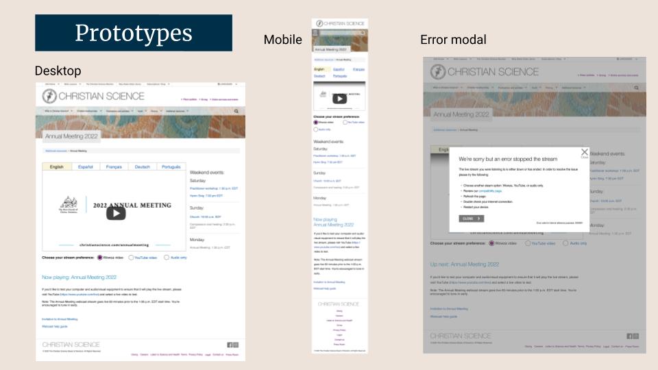
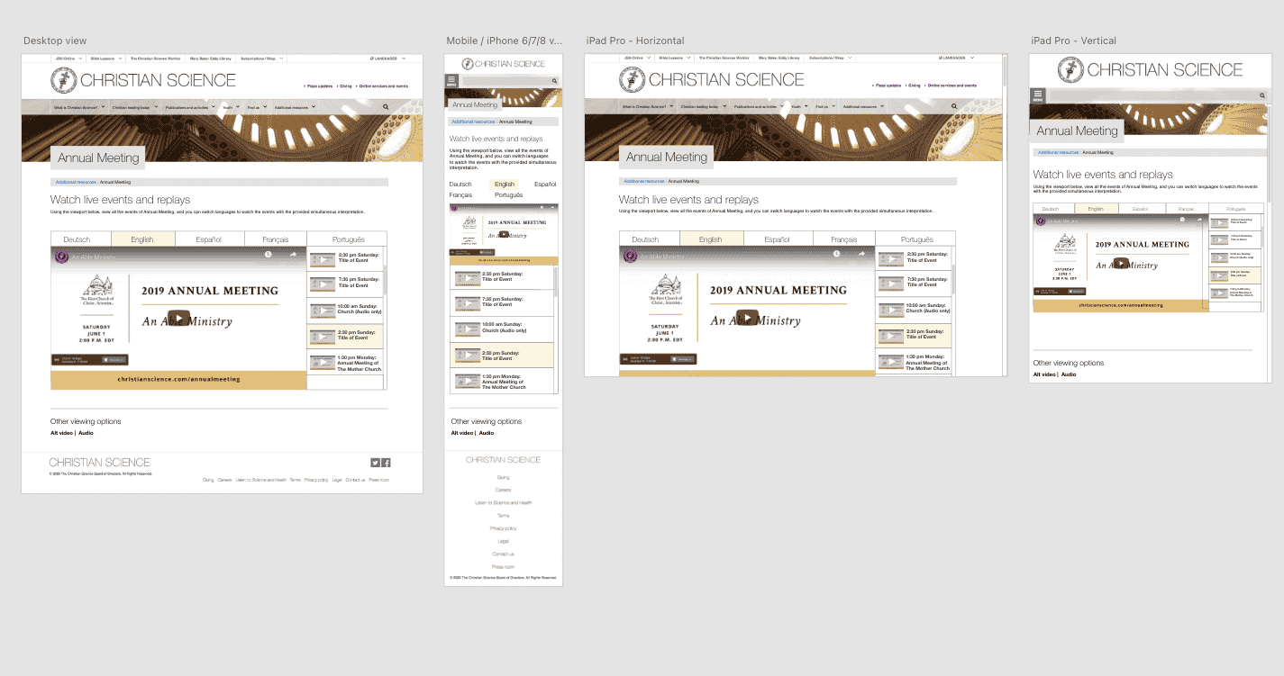
Previous design of the Annual Meeting player — what was initially tested.
Step 4: How we tested
- 6 testers (3 mobile, 3 desktop)
- 2 Church employees, 4 Church members (non-employees)
Steps:
- Pretend it’s AM weekend, how would you tune in live?
- What other weekend events do you see?
Video highlights reel of testing
Step 5: What we learned
Stream options:
- The brand names of the stream preferences were distracting, specifically Wowza
- Stream brand doesn’t matter, people just want a high-quality and uninterrupted stream
- Video stream is preferred over audio for all testers
Error modal
- Multiple bullets in modal were overwhelming and generally not helpful
- Compatibility page sounds not inviting
- For a tech savvy person – error modal is plan b if nothing else works
- Tech savvy people ignore popups
Events sidebar
- It was unclear why some events weren’t clickable
- Users desire to see context and info about the events Have they happened yet?
- What is that event about?
- Who is speaking?
- All users were able to switch languages easily
- One user didn’t see it on mobile at first
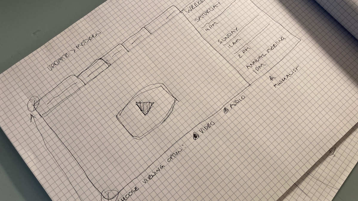
A sketch for the new design.
Step 6: Iteration
- Simplify the viewing choices — offer only “Video” or “Audio”
Error modal
- Make the modal’s language more helpful & simpler, and less intimidating
Events sidebar
- Make links in the sidebar apparently clickable
- Provide titles of events
- Provide date and time
Step 7: Figma prototype
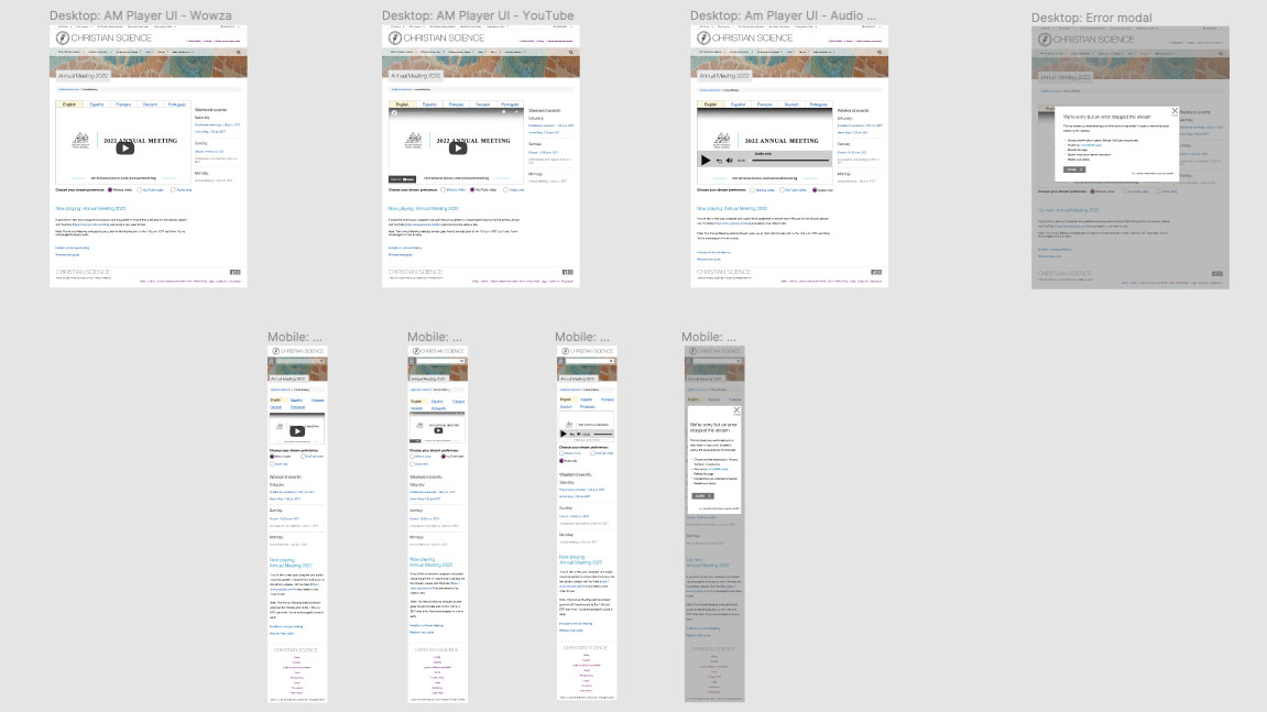
Latest design of the Annual Meeting player — what was tested.
Step 8: Usability testing
Due to time constraints we did internal usability testing and confirmed with team members that what we did with the design matched what the users were requesting before moving to the dev build.
Step 9: Dev build and QA testing
Once everything passed in the UAT testing we moved to the dev build.
I worked closely with developers to build out Jira tickets — which include documenting requirements, changes, as well as user stories, acceptance criteria, and definitions of done.
Step 10: Pushed live
Final step of course is to push it live.
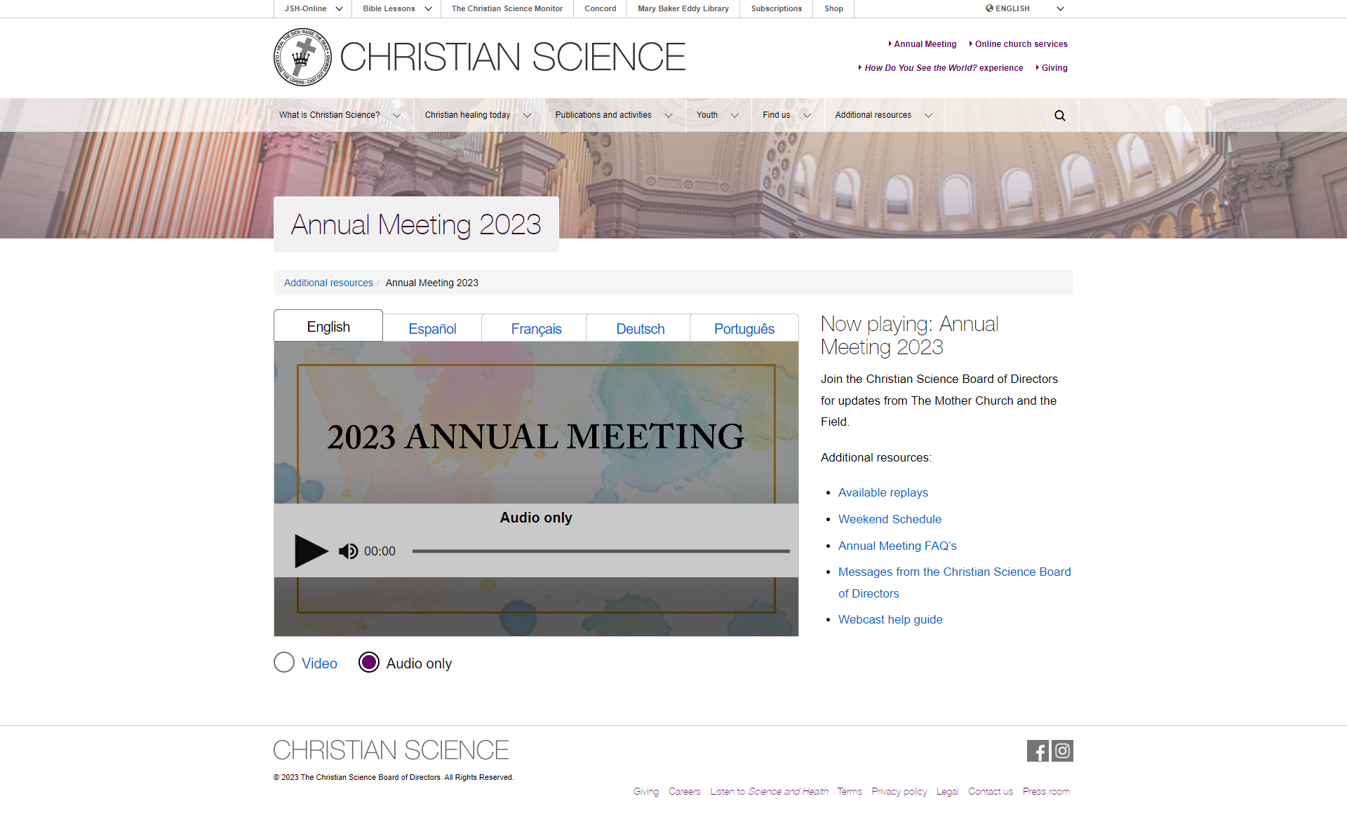
Video view
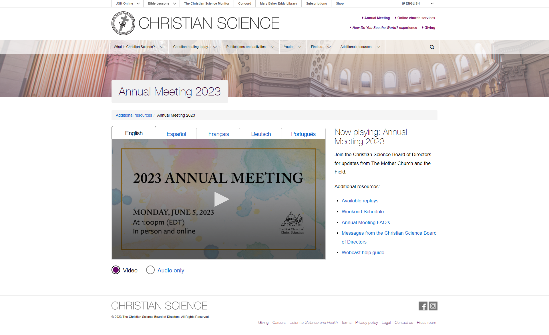
Audio only view