
Tad Blake-Weber, UXC | Portfolio
40 Indian Road | Waltham, MA 02451 | Email me
“Don’t make me dig”— A consolidation of product formats (2021)
Designed using Adobe XD
November 2020 – January 2021
Team:
- Lead UX Designer (me)
- Product owner + Stakeholders
- UX Information Architect/Researcher
- Development Vendor (3rd party)
Context
We have some products on our site with 7-13 different formats — audio downloads, leather covers, paperback, hardcover, etc. How do we make it easier for users to choose the product’s format that they want and purchase it?
Design opportunity
- Help users know they’re buying the correct format they want.
- Provide more of an “Amazon” like experience to choose format options.
- Help customers select other formats without going to a new page.
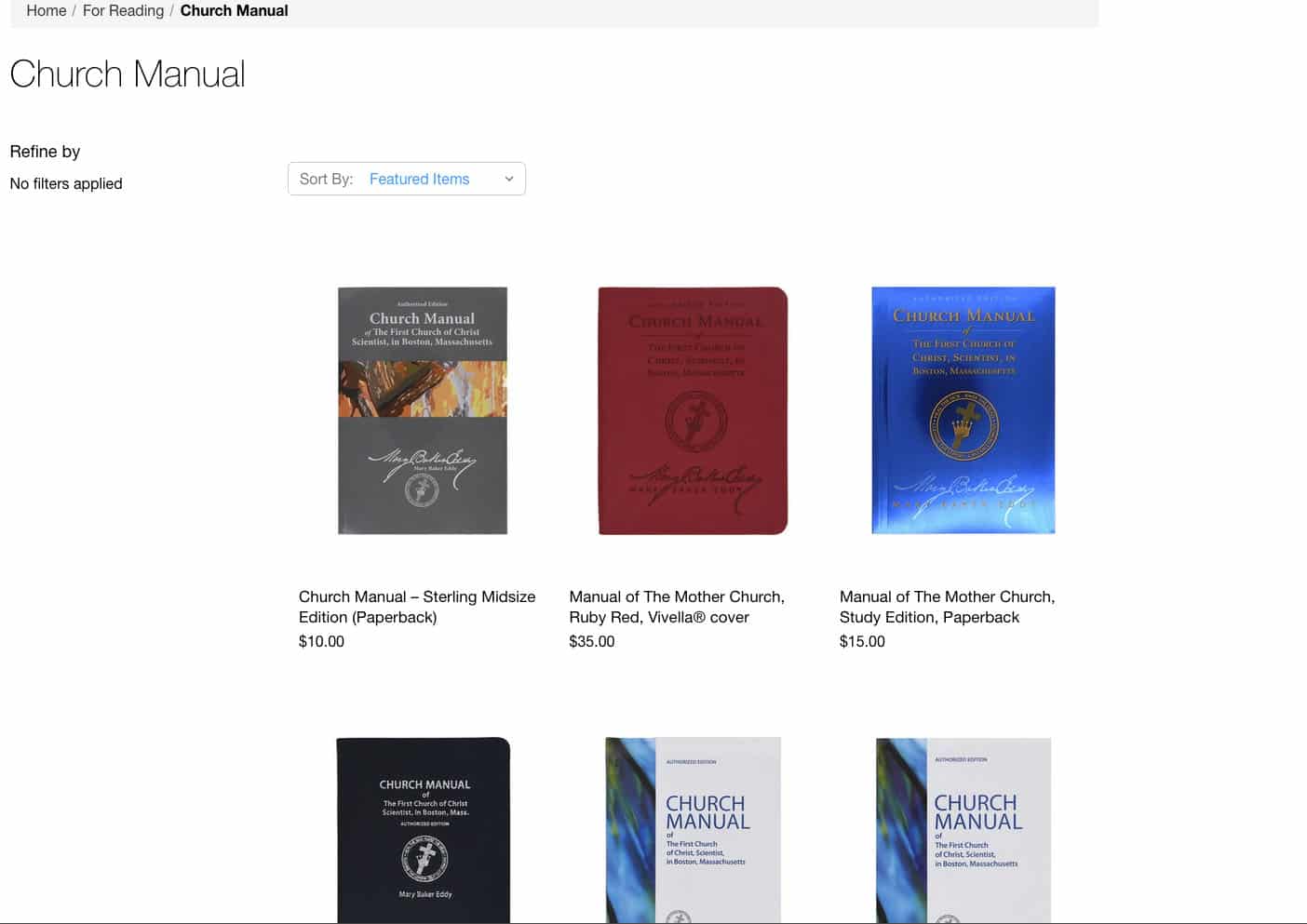
Step 1: Discovery
Discovery Team lead: Information Architect
Supporting role: Me
What we heard:
- People reference image and selected box for format (not title)
- Aaron: relies on picture and selected box (not title) to determine format
- Daniela: said she looks at image and highlighted box
- Lisa: surprised when selected “”Paperback”” that it was Spanish–didn’t immediately notice”
- Daniela: how she knows she’s purchasing hardcover (doesn’t look at title)
- People love images:
- Kelly: cautious about no pics
- Kelly: “On the Wholesale shop the pocket sized books, it’s so helpful that you have that ruler there because everything looks the same in the Sterling edition books online…and that has made a huge difference. That was really good.”
- Lisa: no cover images–it’s strange and I don’t like it
Step 2: Defined scope + made recommendations to stakeholders
- Bring a more “Amazon” like view to the shop via a simple way to select options
- Recommendations:
- Update images — make sure every product has one.
- Make sure that all format option are visible without clicking — on both mobile and desktop
- Use big box/buttons with price inside (screenshot) — on both mobile and desktop
- Show items that are out of stock (and when they’ll be available)
- Keep promotions/related products at bottom of page (under description)
Step 3: Hyphothesis/User statement
- Hypothesis: Providing users with good images and selectable buttons will enable users to choose the product they want sooner and will help remove discouragement from the shopping process.
- User statement: As a user I want to be able to see selectable format options, and clear photos, so that I can feel confident I know which product I’m choosing.
Step 4: Sketch
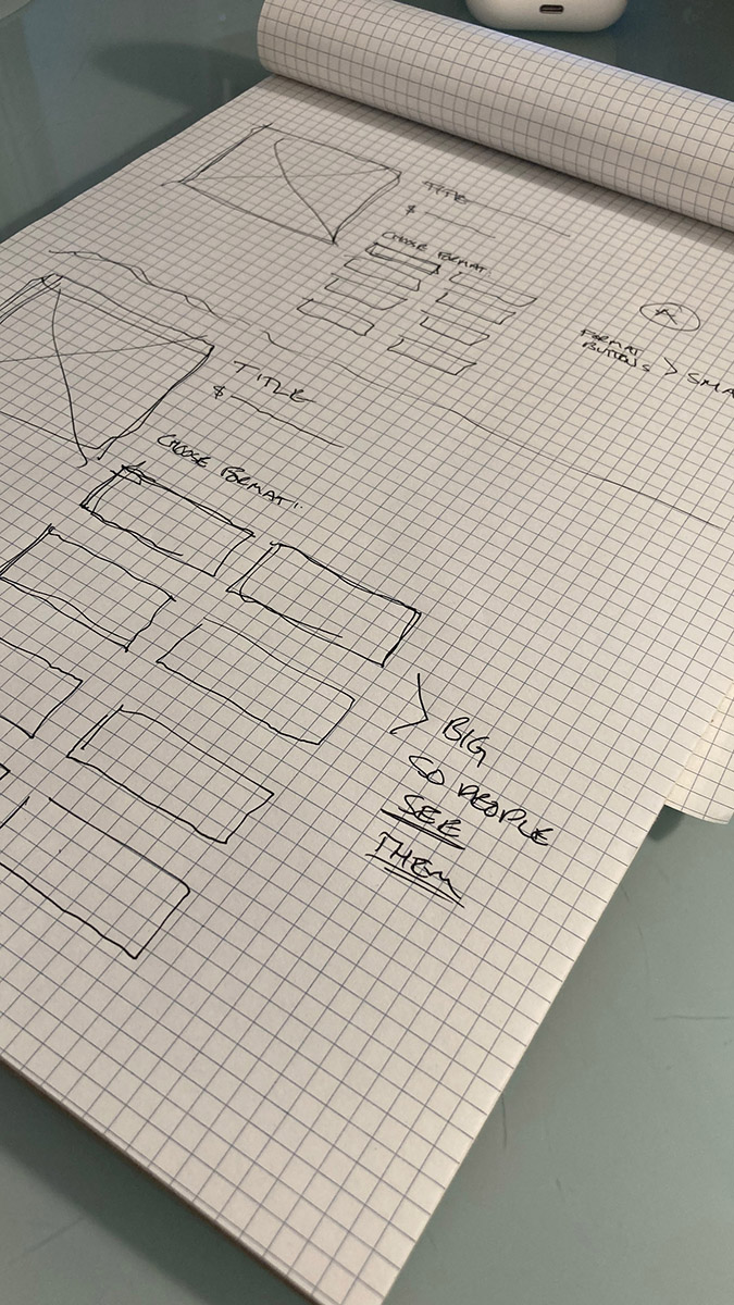
An initial sketch of a couple options of the consolidated format selection buttons (Top small, slender buttons; Bottom: Wide larger buttons)
Step 5: Wireframes
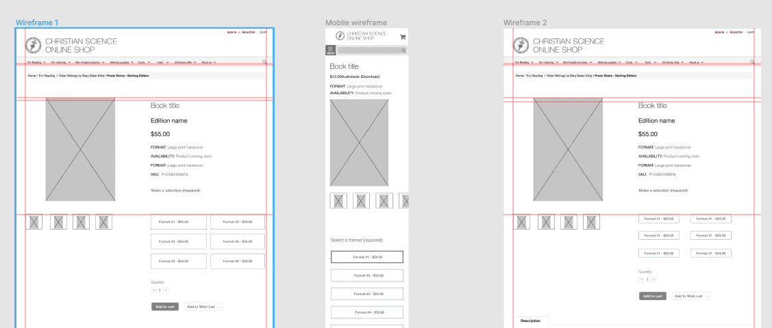
Designing wireframes
- This step was a simple, fairly fast process. Mainly coming up with iterations and views to get a sense of what the layout would look like.
- Our team presented some rough ideas to our Product Owner on our team and then selected the idea the PO liked best to then move forward creating a hi-fi mock up.
Step 6: High fidelity mock up + prototype
Tool used: Adobe XD
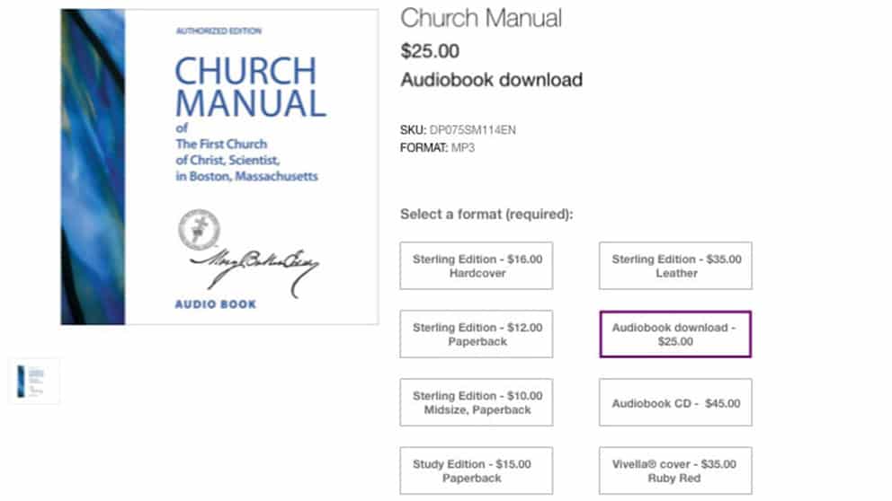
What is involved in making the High fidelity mock up + prototype building?
- This step was a simple takes more time — really aiming to nail down the look and feel and to also get the design ready for testing
- Following internal reviews, iterations and approvals, then we took the next step of building the prototype for testing.
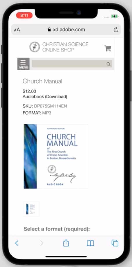
Mock up — Mobile
Click the image to see the XD prototype
Step 7: User testing of the prototype
Testing process: User interviews
Moderators Me and Information Architect
Note takers: Me and Information Architect and Dept SME
Users identified: Via our Information Architect and list of available recruits
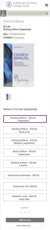
Step 8: Review testing results
- Selected format is clear—especially with different images — but sometimes requires scrolling
- Mobile: selected format on top is okay
- Long list of options overwhelming
- Mobile: last viewed was hard to find
- Confusion about different formats (print/audio) mixed together
Step 9: Recommendations we made to stakeholders
- Continue updating images for formats
- Product page:
- Mobile: Increase font size at top of page indicating format
- Update “Choose” to “Select”
- Remove share icons
- Category page:
- Mobile: Make image clickable & determine what options are with “add to cart” and “quick view” buttons on mobile
- Hide “Browse by & Filters” on mobile
- Hide “Refine by No filters applied” on desktop