
Tad Blake-Weber, UXC | Portfolio
40 Indian Road | Waltham, MA 02451 | Email me
“It’s not intentional” — the redesign of a Video player UI (2021)
Designed using Adobe XD
Started Nov 2019 – Implemented May 2021
Team:
- Lead UX Designer (me)
- Product owner
- Main stakeholders: Board of Directors
- UX Information Architect/Researcher
- SMEs: Internal Software Developer + Audio Engineer
- Development Vendor (3rd party)
Step 1: Discovery
Discovery Team lead: Information Architect
Supporting role: Me
Context and the problem
- Our Annual Meeting is watched my Church members in over 80 countries — and are largest audiences are in 5 different languages.
- We had a default user interface that existed for watching the Church’s Annual Meeting which was never intentionally designed.
- I advocated for the user to be able to watch this important event within a more intentional, user-friendly, and intuitive interface.
- We wanted to support or Board of Directors goal to make our international Church members should feel loved and cared for.
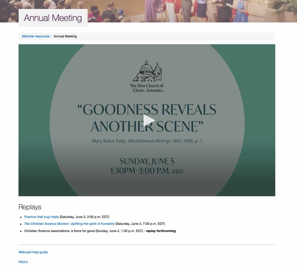
Screen grab of the old player from the Web Archive
(click image to see a larger version)
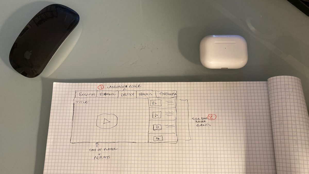
An initial sketch of the Annual Meeting player
(click image to see a larger version)
Step 2: Defined scope + made recommendations to stakeholders
- Make the viewport more user-friendly.
- Make events easier to see and find.
- Make Language options obvious and inclusive.
Step 3: Hypothesis/User statement
- Hypotheses:
- Providing users with a more intentional player design along with displaying the weekend’s events will increase user satisfaction and retention.
- Including the languages will help users feel included and supported.
- User statement: As a user I want to be able to see upcoming events and language so I can move from one event, and language options, easily.
Step 4: Design phase
My goal was to design something that looked more like a console — something that helped users know “this is where I watch the event” and also helped our international field included.
Step 5: User testing
Our team gathered 7 members and we tested the design on mobile to find out whether or not my hypothesis that the design was indeed more user friendly or not.
- We found over-all, users knew exactly what to do.
- There was some confusion with the video/audio options we offered underneath the player.
- Our team swarmed to increase the font size and make the language even more user friendly.
- We decided as a team, and due to time constraints that this had to be our MVP (minimal viable product) as we work in an iterative process and felt we could continue to improve and test the improvements in the future.
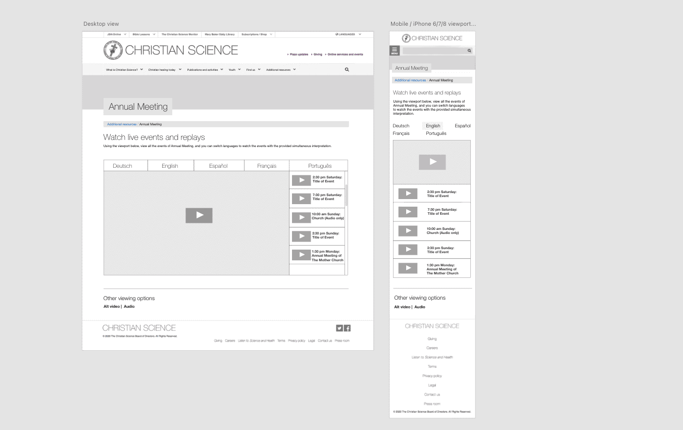
Mock up design
(click image to see a larger version)
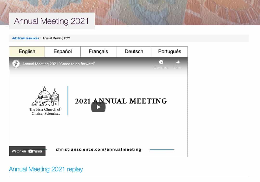
Final design
(click image to see larger version)
Results
- The player was successful overall — no issues arose during our live event on June 7, 2021.
- The player continues to work great also providing a good experience for users watching the replay version.